Early To Rise
I’m sitting on the couch as dawn breaks. Drinking my coffee, snuggling with the pup, and slowly waking up with the sunrise. There are two large pieces hanging in the front window which serve to offer some privacy without completely blocking out the view. As the light changes outside from the blue dark of early dawn to the warmer glow of full sunshine the character of the pieces is changing moment by moment.
Both pieces incorporate iridescent glass. In the first hint of dawn the lamp casts its light on this side of them and brightens what would otherwise just be a rectangle of various lines against a dark window. As the morning gets brighter different shades of glass in the pieces start to sparkle from light on the other side. First the paler transparents, lavender, gold, pale green; then the darker colors, dark teal, plum, and royal purple.

Most of my own work is done with transparent glasses, but I also use another kind of glass called opalescent (often shortened to opal) as accents. Opalescent glass is more opaque than transparent glass. Light still passes through, but it’s partially obscured so that you can’t really see forms behind or through it. It works well for lamps, can be excellent for representational stained glass imagery where it can offer a sense of depth or shading, and is perfect in mosaic where glass gets no light from behind.
For the most part with transparent glass what you see is what you get. The tone and quality of the light passing through the glass may change, but the hue is fairly constant. What I really love about the streaky and opalescent glasses as accents is that often times the hue of the glass changes depending on the light passing through it.
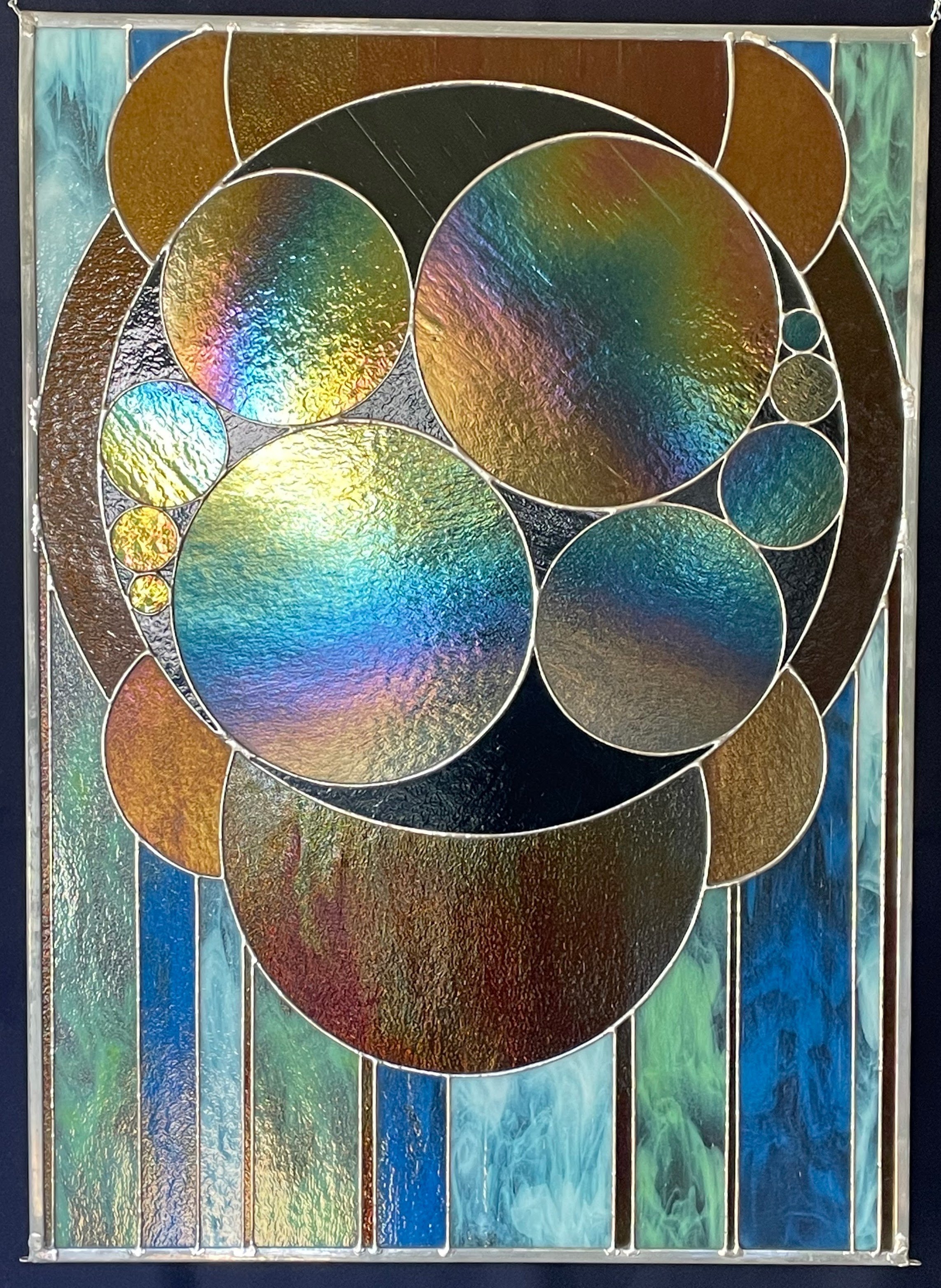
The pieces in my window this morning both use streaky glass consisting of a mix of transparent and opalescent glasses swirled together on the roller table at the factory. The larger piece is called Golden Primes. It is composed of a Golden Ratio rectangle with each increasing square containing the next prime number of overlapping circles from two to thirteen.

In the Golden Primes piece I used a streaky glass that consists of a pale spring green opal swirled in clear. (Here’s an example in the square for number three. It also appears in the square for thirteen.) Or at least that’s the way it looks when the light passing through is at an angle from one’s viewpoint. If the light is passing through in a fairly straight line between the light source and one’s eye then the color changes dramatically from a cool vivid green to a warm, golden, almost mustard-y color.

The smaller untitled piece takes inspiration from a Numberphile video. (I recommend watching it just for Simon Pampena’s utter delight with the method shown. It’s called epic circles for a reason, and I didn’t take my own design that far by a long stretch!)
This piece has three versions of streaky opal glass. The same springy green that I used in Golden Primes, a sky-blue, and a white, each swirled in a clear base. As before the green shifts to a gold-mustard; the sky-blue shifts to a dark, slightly green teal; the white shifts to the slightly pink tinged grey-gold you might see when the sun shines through a column of smoke.
I’ve often remarked that there’s nothing about glass I don’t like, and that I never get tired of it. I’m certain a big part of the reason is that I never get the chance to get used to it. In every moment and shift of light it shows me some new tone or spark I hadn’t seen before. Now if only I could really capture that in my photos!